

The most effective kitchen paint color is rarely a matter of personal whim; it is a calculated response to the room’s Light Reflectance Value (LRV) requirements and existing fixed elements like countertops and flooring. For 2024, the data suggests a definitive shift away from the stark, sterile grays of the last decade toward high-LRV warm whites and low-chroma earth tones. If you are seeking an immediate recommendation for a versatile, high-ROI kitchen color, Benjamin Moore White Dove (OC-17) remains the industry standard for its balanced undertones, while Farrow & Ball Green Smoke (No. 47) has emerged as the premier choice for saturated cabinetry. Choosing a color without first identifying the directional exposure of your windows or the Kelvin rating of your LED bulbs is the primary cause of architectural color failure.
The Science of Light Reflectance and Undertones in Kitchen Environments
Light Reflectance Value, or LRV, is a scale from 0 to 100 that measures the percentage of light a paint color reflects. In a kitchen, where task lighting is critical for safety and function, the LRV of your wall paint can significantly impact the perceived brightness of the workspace. A color with an LRV of 80 will bounce 80% of the light back into the room, whereas a deep navy with an LRV of 10 will absorb 90% of that light. For kitchens with limited natural light, professionals generally recommend colors with an LRV of 60 or higher to prevent the space from feeling subterranean.
Undertones represent the second pillar of kitchen color selection. This is where most DIY projects go wrong. A paint that looks like a clean white on a swatch may reveal a hidden pink, yellow, or blue base once applied to a large surface. This phenomenon, known as metamerism, occurs because the pigment reacts to the specific light wavelengths in your home. In a kitchen with north-facing windows, the light is naturally cooler and bluish. This will exacerbate blue or gray undertones, making a cool white look clinical or even slightly violet. Conversely, south-facing light is warm and golden, which can make a creamy white look overly yellow or dingy.
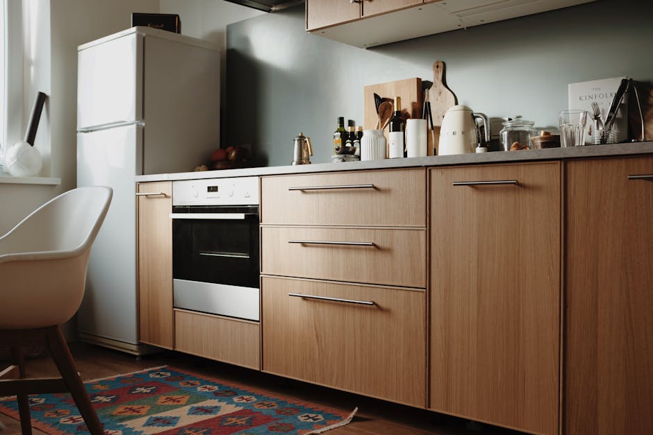
To navigate these complexities, you must evaluate the “fixed assets” of the kitchen. Your cabinets, countertops, and backsplash are rarely neutral. Most granite and quartz surfaces contain flecks of color—be it cool gray, warm gold, or earthy green. The best paint color for your kitchen must harmonize with these existing pigments. If your countertops have a warm gold vein, a cool-toned gray wall will create a visual clash that feels unsettled. Instead, you should look for a “greige” or a warm white that shares those underlying yellow or red pigments. Testing a large sample—at least 12 by 12 inches—against your countertop at different times of the day is the only way to verify how these undertones will behave.
Successful kitchen color selection requires viewing samples vertically against the wall and horizontally against the countertop. Light hits these planes differently, and a color that works on the wall may look entirely different when used on island cabinetry.
Comparison of Popular Professional White Paints
| Paint Name | Brand | LRV | Primary Undertone | Best Use Case |
|---|---|---|---|---|
| White Dove (OC-17) | Benjamin Moore | 83.16 | Soft Yellow/Gray | All-around versatile white for walls and trim. |
| Alabaster (SW 7008) | Sherwin-Williams | 82 | Warm Beige | South-facing kitchens needing a cozy feel. |
| Chantilly Lace (OC-65) | Benjamin Moore | 90.04 | None (True White) | Modern kitchens with very cool-toned marble. |
| Swiss Coffee (OC-45) | Benjamin Moore | 81.91 | Creamy Green/Yellow | Traditional kitchens with wood flooring. |
High-Performance Color Palettes: From Warm Neutrals to Saturated Earth Tones
While whites dominate the market, the current trend toward “moody” or “organic modern” kitchens has brought saturated tones to the forefront. These colors are particularly effective for kitchen islands or lower cabinetry, providing a visual anchor for the room. When selecting a darker hue, the goal is to find a color that has enough gray or brown in its base to feel grounded rather than vibrant. A “muddy” color is almost always more sophisticated in a kitchen than a “pure” color.
Benjamin Moore Hale Navy (HC-154) is perhaps the most famous example of a high-performance saturated color. With an LRV of 6.3, it is undeniably dark, but its heavy gray undertone prevents it from looking like a primary blue. It functions as a neutral, pairing exceptionally well with brass hardware and white quartz countertops. However, because it absorbs so much light, it should be used sparingly in kitchens without significant natural light or a robust artificial lighting plan. The price for Benjamin Moore Aura, which is the recommended line for these deep pigments due to its color-lock technology, typically ranges from $85 to $95 per gallon.
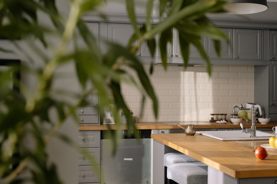
Green has also seen a massive resurgence, specifically in shades that mimic natural elements. Sherwin-Williams Evergreen Fog (SW 9130), a chameleon-like sage green with a gray base, offers a sophisticated alternative to traditional neutrals. It has an LRV of 30, making it a mid-tone that provides enough contrast against white walls without making the room feel enclosed. The primary drawback of these mid-tone greens is their sensitivity to light temperature; under 2700K (warm) bulbs, they can look somewhat muddy or brown, while 4000K (cool) bulbs can make them look overly minty.
For those who prefer the warmth of a neutral without the starkness of white, the “greige” category remains the safest bet for resale value. Sherwin-Williams Agreeable Gray (SW 7029) and Revere Pewter (HC-172) are the titans of this category. These colors bridge the gap between warm beige and cool gray. Revere Pewter, in particular, is a designer favorite for cabinetry because it feels substantial and expensive. It has an LRV of 55, which is the “sweet spot” for many designers—dark enough to show contrast against white trim, but light enough to keep the kitchen feeling airy. Expect to pay approximately $70 to $85 per gallon for Sherwin-Williams Emerald Interior, which provides excellent coverage and washability for these mid-tones.
Top Saturated Colors for Kitchen Cabinetry
- Farrow & Ball Railings (No. 31): A soft black with blue undertones.
- Price: ~$120–$140 per gallon.
- Specs: High pigment concentration with a minimal VOC water-based formula.
- Pro: More forgiving than pure black; creates a soft, velvet-like appearance.
- Con: Extremely high price point; requires a specific F&B primer for optimal adhesion.
- Benjamin Moore Narragansett Green (HC-157): A deep, blackened teal.
- Price: ~$85–$95 per gallon (Aura Line).
- Specs: Proprietary Color Lock technology prevents fading.
- Pro: Looks incredible with walnut accents and gold hardware.
- Con: Heavy pigment load requires at least three coats for full saturation and depth.
- Sherwin-Williams Iron Ore (SW 7069): A cool, deep charcoal.
- Price: ~$75–$90 per gallon (Emerald Line).
- Specs: Antimicrobial agents integrated into the paint film.
- Pro: The perfect “off-black” for modern islands; hides minor scuffs well.
- Con: Shows fingerprints easily if the wrong sheen (like Matte) is used on high-touch surfaces.
The Impact of Flooring Tones on Wall Color Selection
The kitchen floor is often the largest expanse of color in the room, yet it is frequently ignored during the paint selection process. Whether you have natural hardwood, luxury vinyl plank (LVP), or porcelain tile, the floor acts as a massive reflector that casts its own color onto your walls. This is known as “color bleeding.” If you have cherry or red-oak floors, the warmth of the wood will cast a pink or orange hue onto light-colored walls. In this scenario, choosing a wall paint with a slight green undertone (the complement of red) can help neutralize the warmth and prevent the room from feeling overheated.
For modern kitchens featuring gray-toned wood or concrete-look tiles, the challenge is avoiding a “cold” environment. Gray floors paired with gray walls often result in a dreary, flat aesthetic that lacks visual interest. To counter this, designers recommend moving toward “warm grays” or “stony beiges” like Benjamin Moore Edgecomb Gray (HC-173). This color provides enough warmth to balance the cool floor while maintaining a contemporary, neutral vibe. When evaluating your floor, look at the darkest grain or the grout line; these often provide the most accurate clue for which direction your paint undertone should lean.
Technical Specifications for Kitchen Surfaces: Sheen, Chemistry, and Lighting Interplay
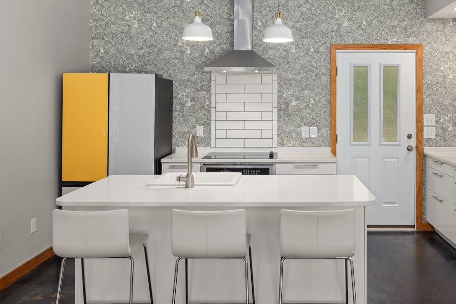
The best color in the world will fail if the paint chemistry is not suited for the kitchen environment. Kitchens are high-moisture, high-grease zones that require frequent cleaning. Standard flat or matte paints are generally unsuitable for kitchen walls because they are porous; grease and steam will penetrate the surface, and scrubbing will cause “burnishing,” or shiny spots where the pigment has been rubbed away. For walls, an Eggshell finish is the professional recommendation. It provides a soft, low-reflectance look that hides wall imperfections while offering enough of a resin barrier to allow for light scrubbing.
Cabinetry requires an entirely different class of paint. Standard wall paint is too soft for the constant contact and movement of cabinet doors. Professionals use water-borne alkyd resins, such as Benjamin Moore Advance or Sherwin-Williams Emerald Urethane Trim Enamel. These paints behave like oil-based paints—leveling out to a smooth, factory-like finish—but clean up with water. For cabinets, a Satin or Semi-Gloss finish is mandatory. The higher the sheen, the higher the resin content, which translates to a harder, more durable surface. However, high-gloss finishes will highlight every nick, grain, or brush stroke, making them difficult for DIY application.
Comparison of Professional Cabinet Paint Lines
| Product Name | Resin Type | Dry Time (to touch) | Recoat Time | Durability Rating |
|---|---|---|---|---|
| BM Advance | Waterborne Alkyd | 4–6 Hours | 16 Hours | Excellent (Hard, furniture-like) |
| SW Emerald Urethane | Urethane Alkyd | 2 Hours | 4 Hours | Superior (Impact resistant) |
| F&B Modern Eggshell | Water-based Acrylic | 2 Hours | 4 Hours | Good (Mid-range hardness) |
Artificial lighting is the final, often ignored, variable in the kitchen paint equation. The Color Rendering Index (CRI) of your light bulbs determines how accurately the paint color is displayed. If you have spent hours picking the perfect warm white, only to install cheap LED bulbs with a low CRI, your kitchen will look flat and gray. Aim for bulbs with a CRI of 90 or higher and a color temperature between 3000K (warm white) and 3500K (neutral white). Anything higher than 4000K will make your kitchen look like a surgical suite, stripping the warmth from even the creamiest paint colors.
Paint Sheen Selection Guide for Kitchens
- Ceilings: Flat. You want zero reflection here to hide imperfections and prevent glare from recessed lights. Standard ceiling paint is sufficient, but for kitchens with high humidity, a moisture-resistant flat is preferred.
- Walls: Eggshell. The perfect balance of durability and aesthetic. Avoid matte unless using a specialized “scrubbable matte” like Benjamin Moore Scuff-X, which is designed for high-traffic commercial zones.
- Trim and Baseboards: Semi-Gloss. Needs to withstand vacuum cleaners, mops, and constant foot traffic. Semi-gloss is significantly easier to wipe clean of dust and pet hair.
- Cabinets: Satin or Semi-Gloss. Satin is currently more popular for its modern, understated look, while semi-gloss offers maximum scrubbability for families with young children.
- Backsplash Area (if painted): Semi-Gloss or Gloss. If you do not have tile and are painting the area behind the stove, this surface needs to be essentially waterproof and grease-proof.
Common Pitfalls: Why Your Kitchen Color Might Look “Wrong”
One of the most frequent mistakes in kitchen design is failing to account for the “shadow gap” under upper cabinets. Because this area receives significantly less light than the rest of the wall, the paint color will appear two to three shades darker than it does on an open wall. If you are using a mid-tone color, this can make the backsplash area look muddy or dirty. To combat this, some designers suggest “cutting” the paint color by 50% with white for the backsplash area to ensure it matches the perceived lightness of the rest of the room.
Another error is ignoring the “Cool vs. Warm” rule of metals. If your kitchen features stainless steel appliances and chrome fixtures, these are inherently cool elements. Pairing them with a very warm, yellow-based cream can make the paint look aged or “nicotine-stained.” In a kitchen with heavy stainless steel, a “cool neutral” with a blue or green base will feel more intentional and cohesive. Conversely, if you have invested in unlacquered brass or copper hardware, you need the warmth of a cream or a rich earth tone to make those metals pop.
Before committing to a gallon, you must perform a “site-specific” test. Paint a large piece of foam core board rather than the wall itself. This allows you to move the sample around the room to see how it looks in the shadows under the cabinets versus how it looks next to the window. Observe the sample at 8:00 AM, 2:00 PM, and 8:00 PM under artificial light. If the color maintains its integrity across all three time periods, you have found the best paint color for your specific kitchen. This analytical approach eliminates the guesswork and ensures that your investment in labor and materials results in a professional-grade finish that enhances the architectural value of your home.


